Brand kit
Logo files, colors and type for anyone writing about Kondora. Keep it simple: plum on paper, generous space, no effects on the mark.
Logo
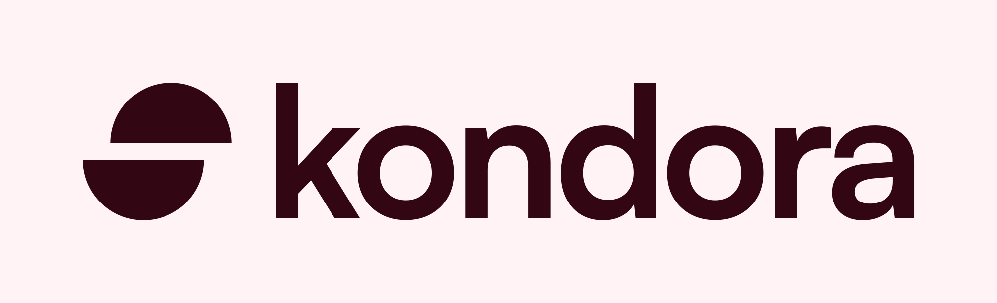
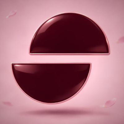
The mark is a split coin: two half discs, YES and NO, shifted apart by leverage. Clear space around the logo equals the height of one half disc. Minimum size 16px for the mark, 80px wide for the lockup.
Color
Paper outside, plum inside, one yellow for action. Click a swatch to copy its hex.
Type
Satoshi for everything, from 300 to 900. Geist Mono only for addresses and hashes. Numbers are tabular.
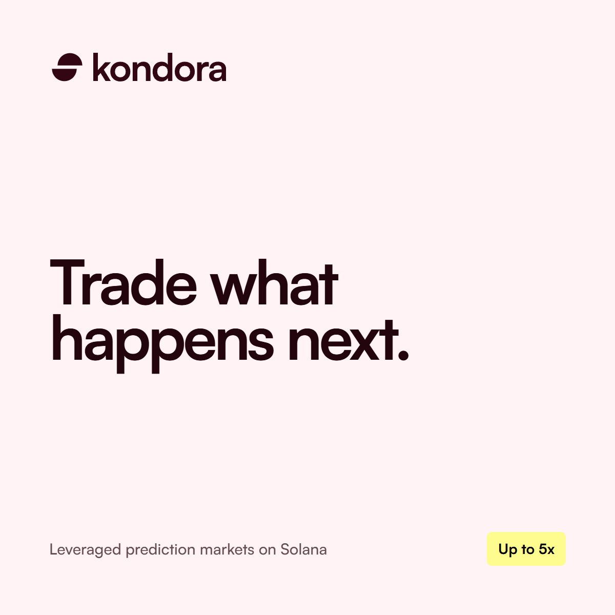
Trade what happens next.
Section titles are Satoshi Medium, large and tight.
Body copy is Satoshi Regular in mauve on paper. Short sentences, plain words, no hype.
Buttons
Radius 10, a petal square with a chevron leads every primary action. Never pill shaped.
Imagery
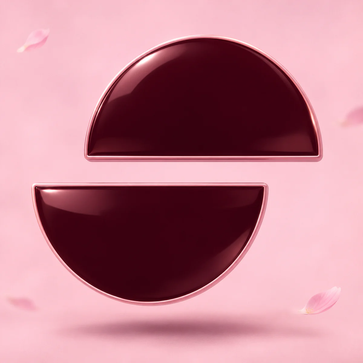
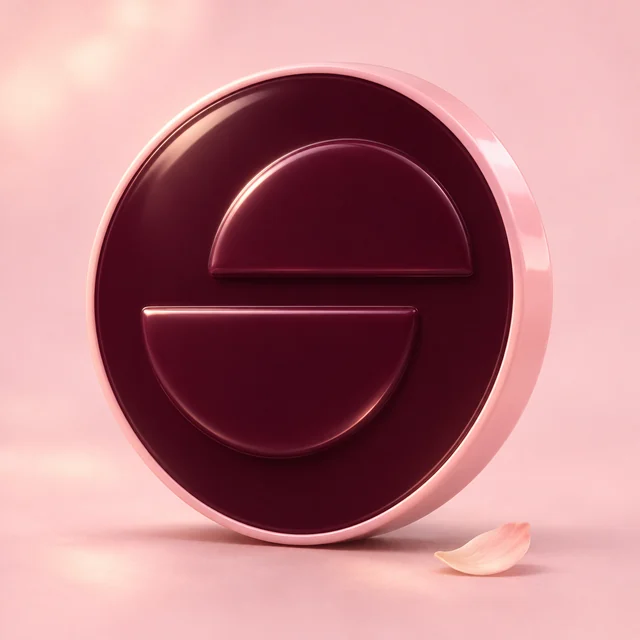
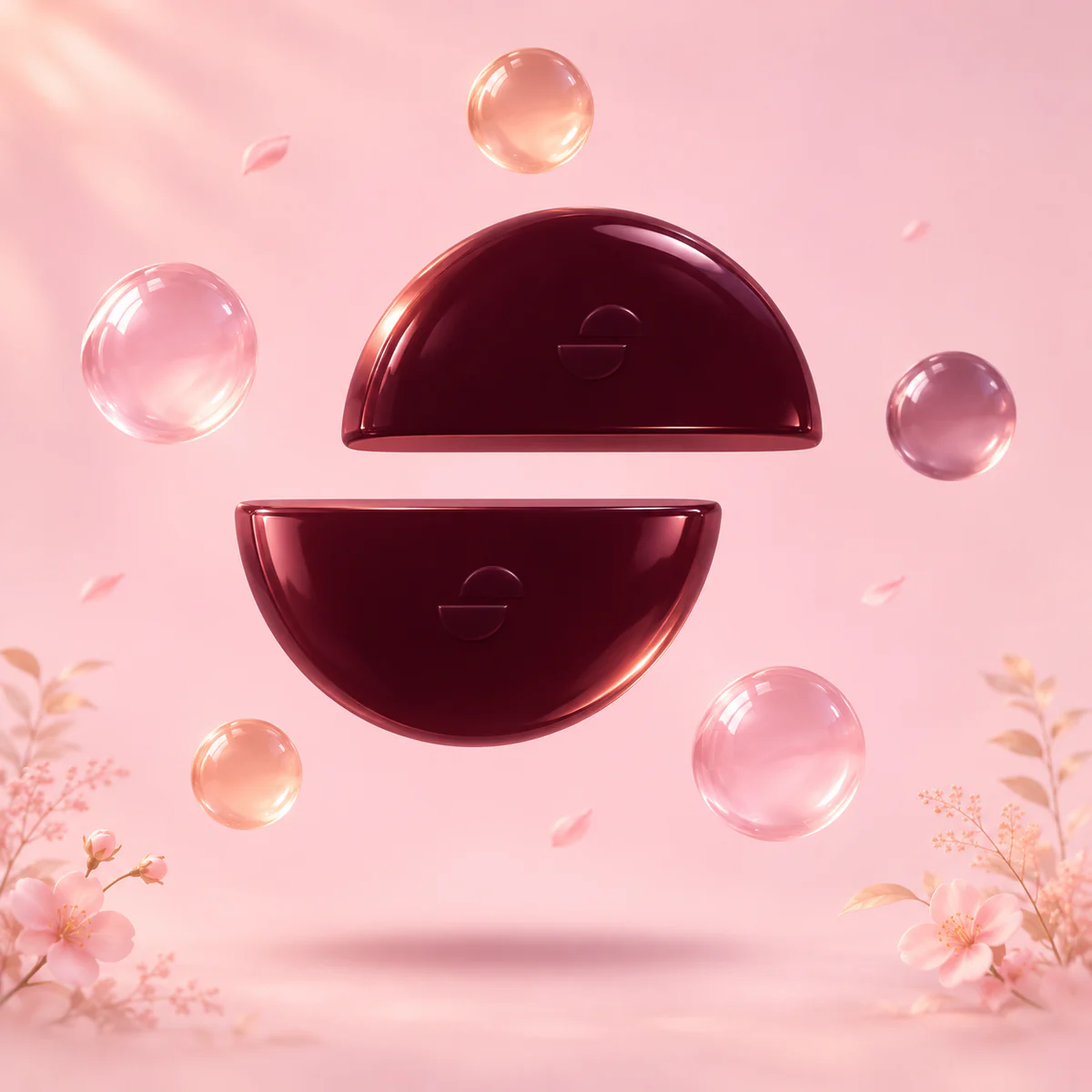
Dreamy pastel 3D: soft blossoms, warm haze, glossy plum and petal objects that carry the split-coin mark. Plain blush backgrounds for objects. Low saturation, light grain. No people, statues, animals or night skies.

Social
Profile pictures, banners and share cards, ready to upload. The X banner keeps its copy on the right so the avatar never covers it.
















Do and don't
A few rules that keep the brand recognizable.
Do
- Use plum on paper or paper on plum.
- Keep the two halves of the mark offset exactly as drawn.
- Write the name in lowercase in the logo, Kondora in text.
- Leave clear space equal to one half disc.
Don't
- Rotate, stretch, outline or add shadows to the mark.
- Close the gap between the halves or flip the offset.
- Put the logo on busy imagery without a solid panel.
- Use pill shapes, gradients on the logo or other typefaces.